A Graph is a concise view of some data. It is much easier to work out the meaning of a pie chart illustration or bar graph than it is for a collection of data. A graphic placed right in the presentation can help your audience have an “aha!” to understand the data. When you have a lot list of data, it is common to translate it into a graph and analyze it. If it is looking for trends or the largest part of something, it will appear quickly in the chart. In the right conclusion, the graph gives meaning to data.
One of the tools for creating graphics is Google Sheets. Google Sheets can be obtained for free and can use from the browser in real-time, so there is no need to buy tools or other programs such as the example of Microsoft Excel. In this tutorial, we will teach you how to use Google Sheets to create attractive charts easily and quickly.
How do we make a graph on Google Spreadsheets for the first time? If you don’t have a google account yet, start by going to the Google Drive Start Page. From you can begin to log in with an existing Google account or create a new Google account.
1. Create a New Sheet
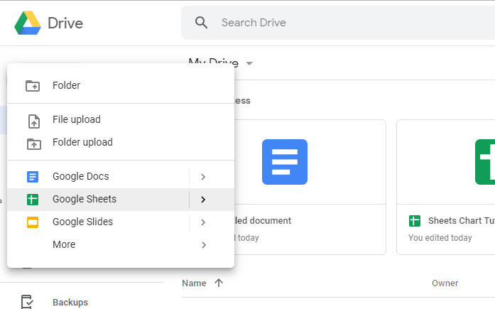
After logging into your Google Drive account, create a new sheet by pressing New and selecting Google Sheets. It will create a new spreadsheet to which you can add data and then graph using that data.
2. Add A Data
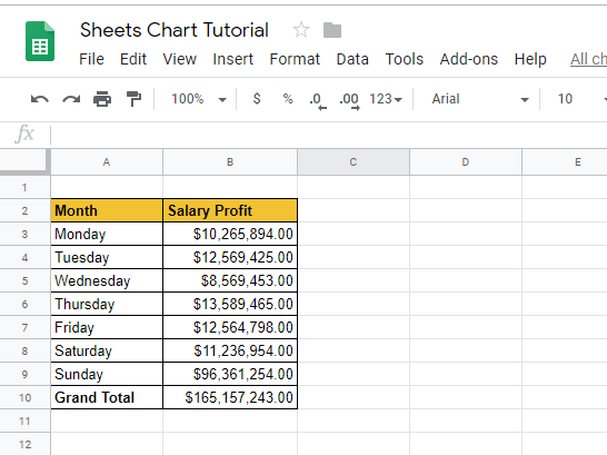
Each chart starts with data in a Sheet. Each must be on its line in the spreadsheet.
3. Block Data
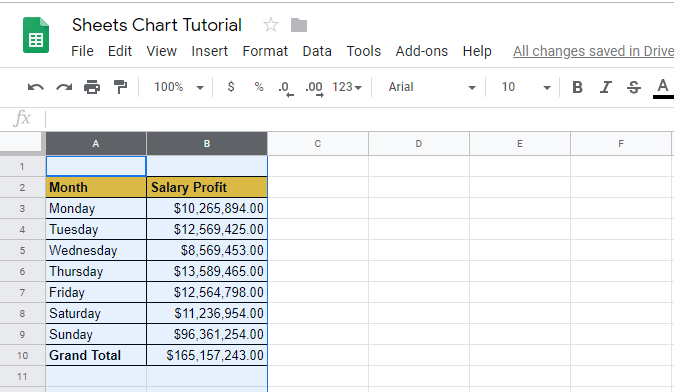
After adding data to the Sheets, highlight the columns you want to include in the chart. The easiest way to do this is to press the headers column (the vertical line with the letters above) and block the data.
It would be excellent for blocking the entire column. This way, when adding data it will automatically go into the chart, and update in real-time. It can also only highlight the columns to be entered as data. Click into a column to insert it into the chart and then hold Ctrl in Windows (Cmd on Mac) and click the other column header.
4. Choose Insert > Chart
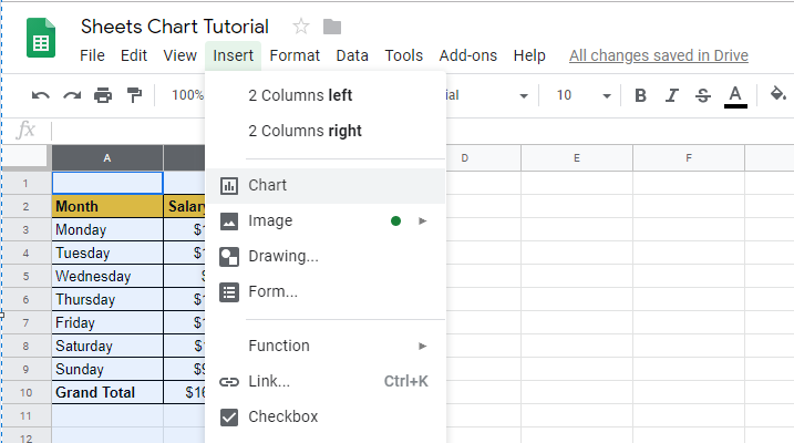
If you have selected data, click the Insert menu in the Spreadsheet menu bar. Select Chart to insert into Google Sheets.
5. Choose the Google Sheets Graphic Format
If you have released Google Sheets charts, you can then choose between variations of the chart format. The chart type you selected should be format on the data you have worked with, and how you want the data to be displayed.
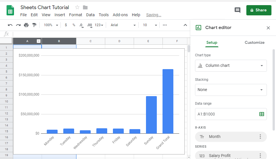
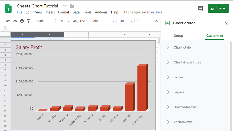
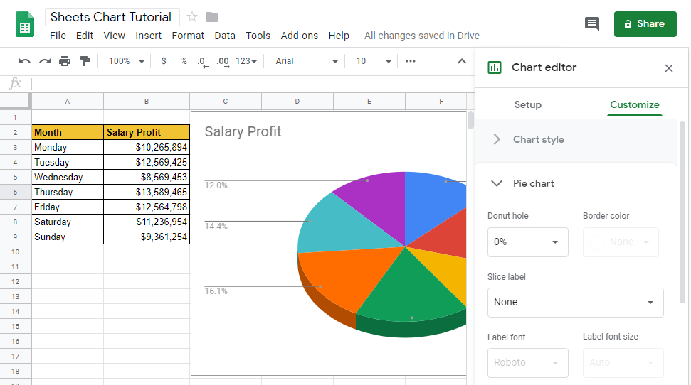
After the chart editor appears to the right of the spreadsheet, there are two tabs to create a chart for the first time, namely the Setup tab and the next to the Customize tab. These two tabs each function to change and custom graphics as shown below :
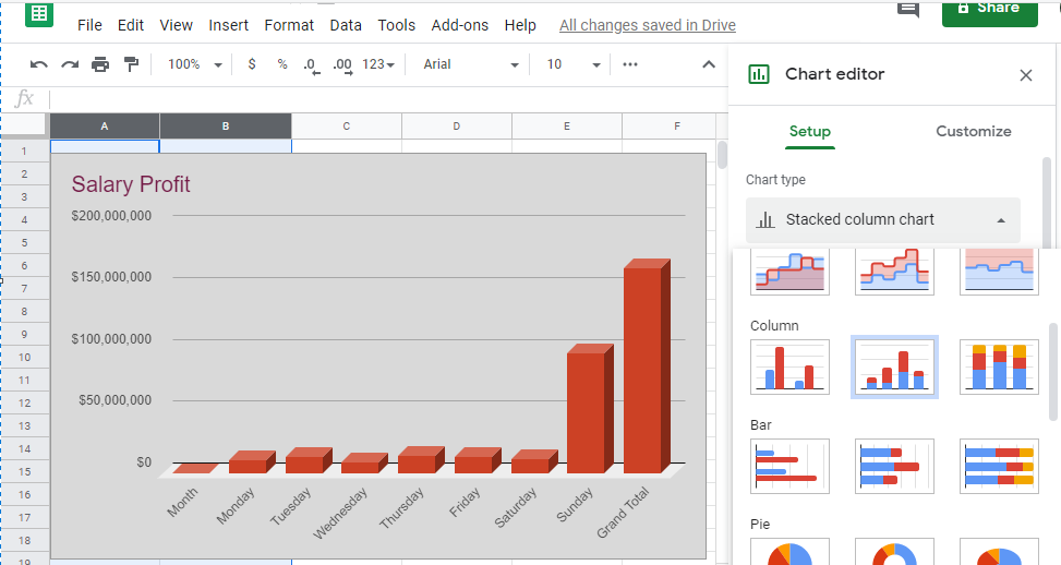
Click Chart Types from the Chart Editor menu to select the available chart types as desired.
Besides, you can also select Customize to tweak the appearance of the graphics. The customize tab displays several menus as features to make Google charts better as you wish.
6. Google Graphics Customize
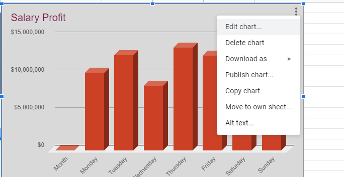
After inserting the chart into the Google Sheet, you can then customize it to make it appear the way you want, including updating the chart title and changing the display style. To access the edit options, right-click (click on the Mac) or click the colon on the chart you just placed and select Edit Chart. It will open up the chart customization options to design the graphic to your liking.
There are many options for customizing a chart, from changing the chart title or line color. Below, you can see an example of modified graphs, or chart:
Note that you can also switch back to Chart Types in the Setup tab menu if you want to change the entire chart, like an example above, if you have to change from a bar chart to a pie chart.
It has now successfully created the first Google Sheets chart. Now it’s time to think about the best usage and differences of Google Sheet Charts. Let’s keep learning.
GOOGLE CHART TYPE
Here are some sample images of each chart with instructions for when to use them.
A. Line Graph
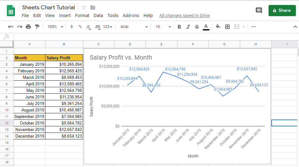
When to Use It? To show the audience how the data changes over a period of time.
Example – Shows the company’s income expense, month by month.
See the following image:
A line graph is excellent for time-based data. For example, if you wanted to see how a company was performing each month, you could plot profits over time to see the results of the company.
B. Area Graph
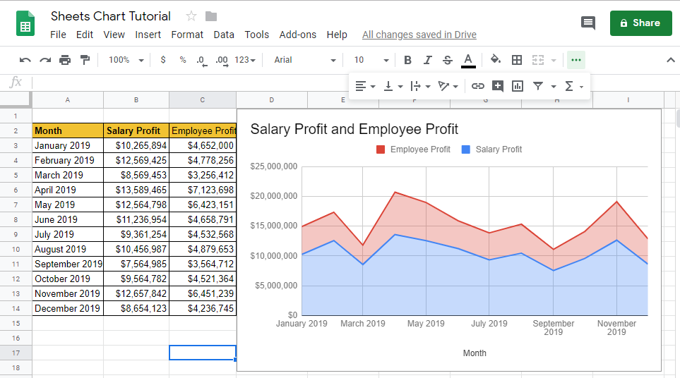
When to Use It? Displays two related sections to create total data from the table.
Example – Show total employee costs by stacking salaries, and benefits.
Area charts give a sense of scale by coloring the area under the lines. This time use it to “build up” a cost or amount by stacking rows on top of one another.
C. Column Graph / Line Graph
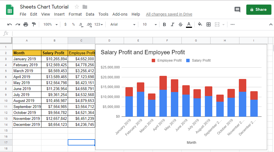
When to Use It? Displays the height of each item and compares related items.
Example – Use a bar chart to present the value of daily steps to easily comparing with other days.
Column and bar charts are similar, in that they use vertical lines to represent values. Column charts use vertical lines, while bar charts use horizontal lines. In both cases, these charts can help you understand the data for the items.
D. Pie Chart
When to Use It? Displays the links from one part of the project to all section of it.
Example – Shows the percentage of time spent on each project.
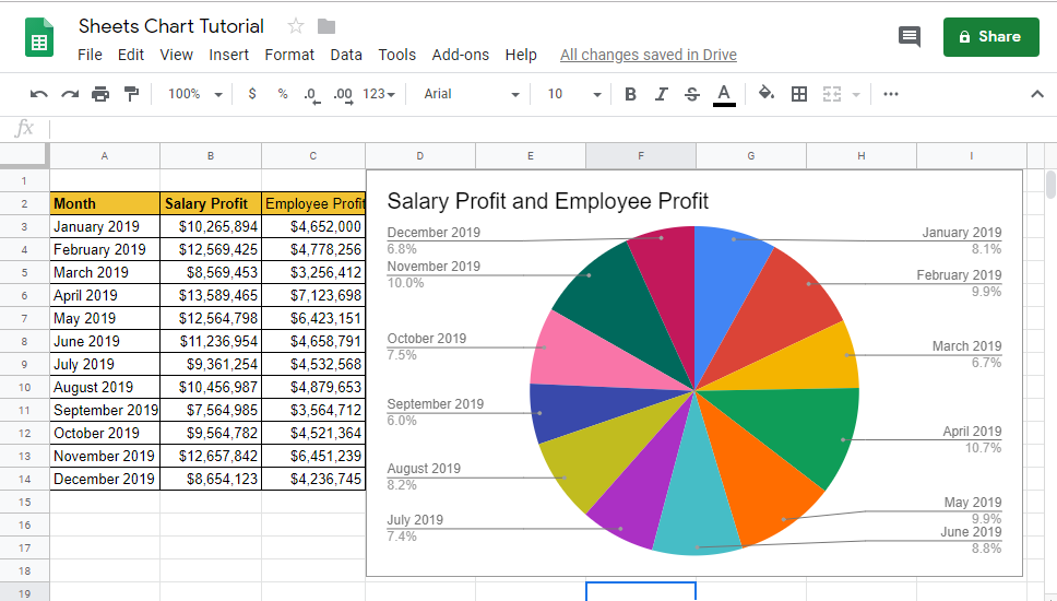
A pie chart is a classic presentation tool, showing how parts of the data relate to the whole. You can use a pie chart to draw attention to how much time has spent on a particular job, for example:
Google Sheet pie charts will automatically help to calculate percentages. Place the existing data in two columns and create a pie chart to automatically split the values into categories.
Then, which type of google sheets chart should I use? Choosing a chart type is a personal choice, as many types of charts are crossed in the way they use data. It will be easy to switch between chart types and customize in Sheets. The main tip in using graphics is to start by thinking about what the audience wants to say. Think about what that data means and choose the type of Google graph that delivers the message.
Hopefully, useful for you. Share the article to social media, share the knowledge for those who need it… Thanks…


